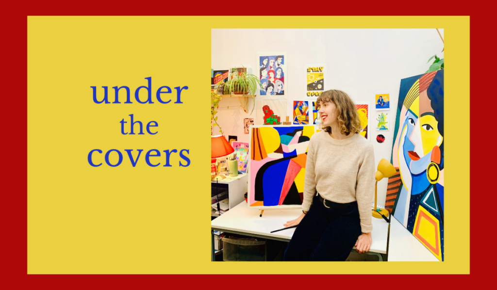
Claire Prouvost talks about typeface—and facing the blank page—in the next in our series Under the Covers, about designers and artists in the book world.
How do you start?
I usually start by reading the brief and doing a little research if I am not familiar with the topic. I will then start sketching ideas for keywords. I rarely get to read the full book, but will get a sense from extracts, and the creative brief including some reference images.
What is the most misunderstood aspect of cover design?
The amount of time that can go into the composition. There are multiple layers of design required on a book cover, from the illustration or image used, to how it will interact with the text and typography. Paying attention to the typeface used is also a very important part of book design, as it will give the reader the tone of the book. When I think about it, we have to send a lot of information and grab the attention of the reader through one image.
How much influence should/does the author have in the eventual design?
Perhaps the author has an idea or a vision, but I think a design is a collaborative piece based on trust, and that everybody has a role to play in the making of a successful book. Also, most publishers would do market research and give direction to the designer, who will execute the task to the best of their knowledge.
Do you have the freedom to design exactly how you want to, or are you constrained by other factors?
There is often a marketing research from the publisher that will lead to a brief for the designer/illustrator. I rarely get approached to design a book cover from scratch, with total freedom of interpretation. I like to get a bit of direction when starting on a new project, so I like to work with a team and get the feedback from the publishers and author.

What is the best aspect of being a cover designer, and what is the worst?
It is very rewarding to see the book you have designed on the shelves! From the concept and the digital artwork, it is always enjoyable to get a real copy in your hands. Like most creatives, the fear of the blank page is the worst when starting a new project!
Who is a designer that you greatly admire?
I have worked for years with the designer Graham Thew, and I admire his skills, and the personality he manages to add to every project.
Are there any design clichés, tics or habits that get under your skin?
Cheap stock images, bad font choices, compositions lacking subtlety.
What do you look for in a good cover design, and do you think designers assess book covers differently?
We surely do! Hard to explain why but you really get to understand why some designs work and others don’t. You often see some books that would benefit from a good makeover!
You can find out more about Claire on her website or on Instagram


