Alan Keogh talks about the balance of space and the invisibility of beautiful design in the next in our series Under the Covers, about all things artful in the book world.
How do you start?
What I generally like is for the author to provide a synopsis of the work—not strictly the narrative but what the book means and what they are trying to convey. Their own view has far more texture and offers greater insight. This, along with an objective view, can give a broad range of interpretations and greater scope for design.
What is the most misunderstood aspect of cover design?
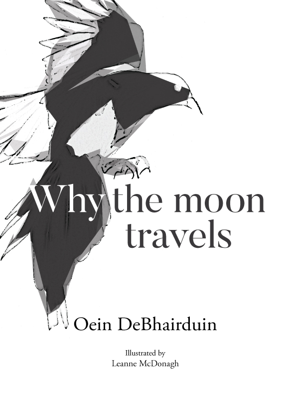
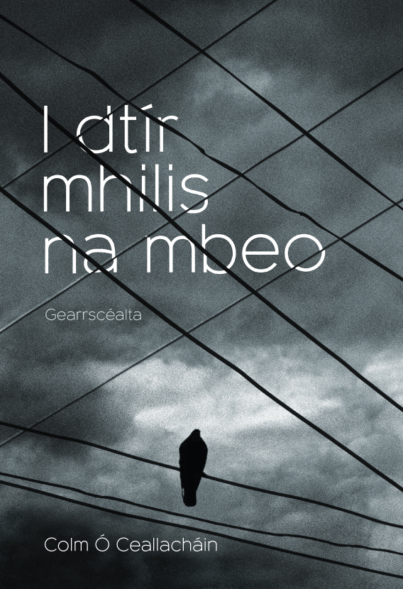
The balance of space and the subtlety of typography. The more effortless it seems, the more work has gone into it.
How much influence should/does the author have in the eventual design?
Depending on the author and their overall vision of the project as a whole, the level of influence differs greatly. Some see the entirety as a complete package and direction will be given. Others enjoy other perspectives and their expression—which can be fun. Design options considered as non-runners are sometimes winners and vice versa.
What is the best aspect of being a cover designer, and what is the worst?
Spending time browsing designs and acknowledging great work and beautiful pieces of art. Trying to live up to that standard is both a weight and a motivation.
Do you have an author that you’d love to design covers for?
Haruki Murakami. I enjoy surrealism and his particular blending of genres and themes. There are so many motifs and layers to his writing – an almost inexhaustible well of imagery and meaning for readers and designers alike.
Who is a designer that you greatly admire?/Is there a recent cover that you wish you’d designed?
If I am in need of a refresh as I tend to revisit the works of Saul Bass. I find it gives focus and recrystalises what is required and how best to get it across in as simple and visual a way as possible. Years old but as fresh as any design today.
In 2008 Penguin released a centenary collection of James Bond books with prints by Michael Gillette. I loved these: the colour, the typography, the crops and white space. Beautiful!
Are there any design cliches, tics or habits that get under your skin?
To be honest I find the quality of book design in general to be of a very high level. I do find genre clichés to be slightly tiresome, books generally come with marketing requirements but good design will always stand out.
What do you look for in a good cover design, and do you think designers assess book covers differently to someone browsing in a book shop (and how do you negotiate these two things)?
I am definitely more attracted (and likely to purchase) a book with a more interesting cover. To me it gives more currency to the book as a whole – investment, effort and creative license has been given to help complete the endeavour. A clever or interesting cover piques interest more than a standard design.


