Fiachra McCarthy chats to Ruth McKee about the beauty of constraint, and the joy of being various
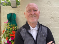
My name is Fiachra McCarthy, I’m a graphic designer and run my own studio out of Stoneybatter, though I’m currently relocating to Kerry. My work is split between book cover and interior design, magazine design and various branding work.

Before getting involved in book design I worked for many years as a magazine art director for titles such as Hot Press, IMAGE and House and Home. I collaborated with editors to create arresting designs which harmonised with the writing—this was a great foundation for book cover design.
I regularly design covers for Tramp Press and have also worked with BlueMoose, New Island, Merrion Press, Gill Books and Wordwell on cover and interior designs.
How do you start? Do you work from the title, or do you read the book first to have an understanding of its mood and style?
There’s never really one way of starting. Some publishers will provide a manuscript and let you draw your own conclusions, others will have very detailed briefs with tear sheets and directions. While starting with the manuscript can be a challenging and exciting way to begin, over time I’ve come to really enjoy working with editors and publishers on briefs; it can really get everyone involved and invested in the process from day one. I’ve also realised that what can be just as valid as my own response to the book, is investigating what made the editor or publisher respond to this book and want to dedicate their resources, time and effort into seeing this book get onto bookshop shelves.
How much influence should/does the author have in the eventual design?
It really does depend, I’ve had jobs where I’ve never communicated once with the author; the publisher has acted as a mediator for the whole process. If there’s clear communication and expectations this can work very well. In other instances I’ve had meetings or phone calls with the authors early on; this can really give you a feel for the thinking and process behind the book. I tend to hope that once we’ve had that initial chat, they trust me to do my job and we won’t need to talk again till the book launch!
On two occasions, an author has killed a cover design at a late stage. While it feels frustrating and disappointing at the time, I can safely say in both cases we got stronger covers in the end from starting over again.
I often think of how long a writer spends at their desk chipping away at a book month after month and I think it’s fitting that they should feel really proud of every aspect of the finished book.
What designs are your best or your most interesting work so far?
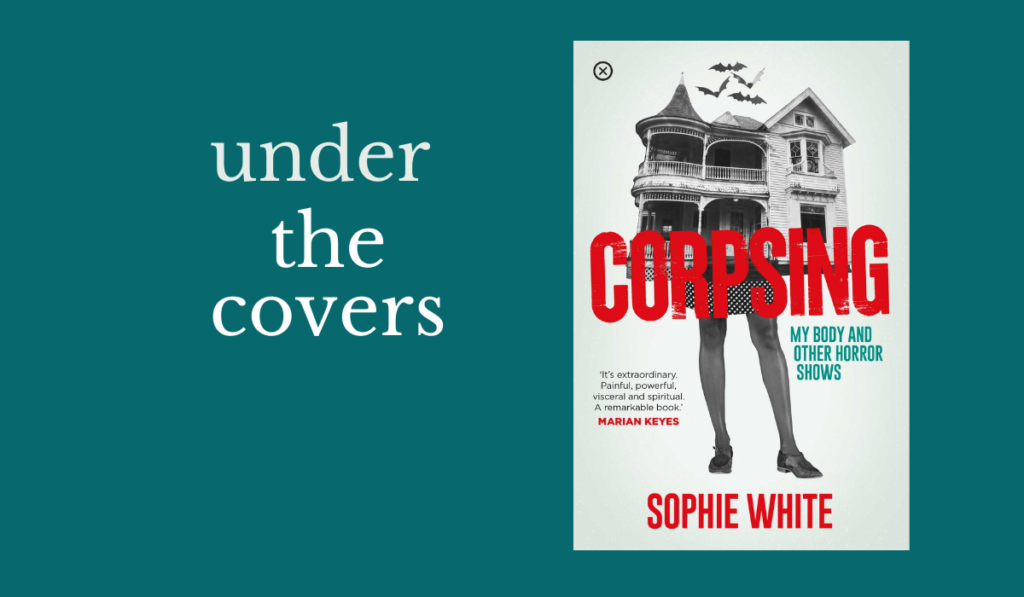
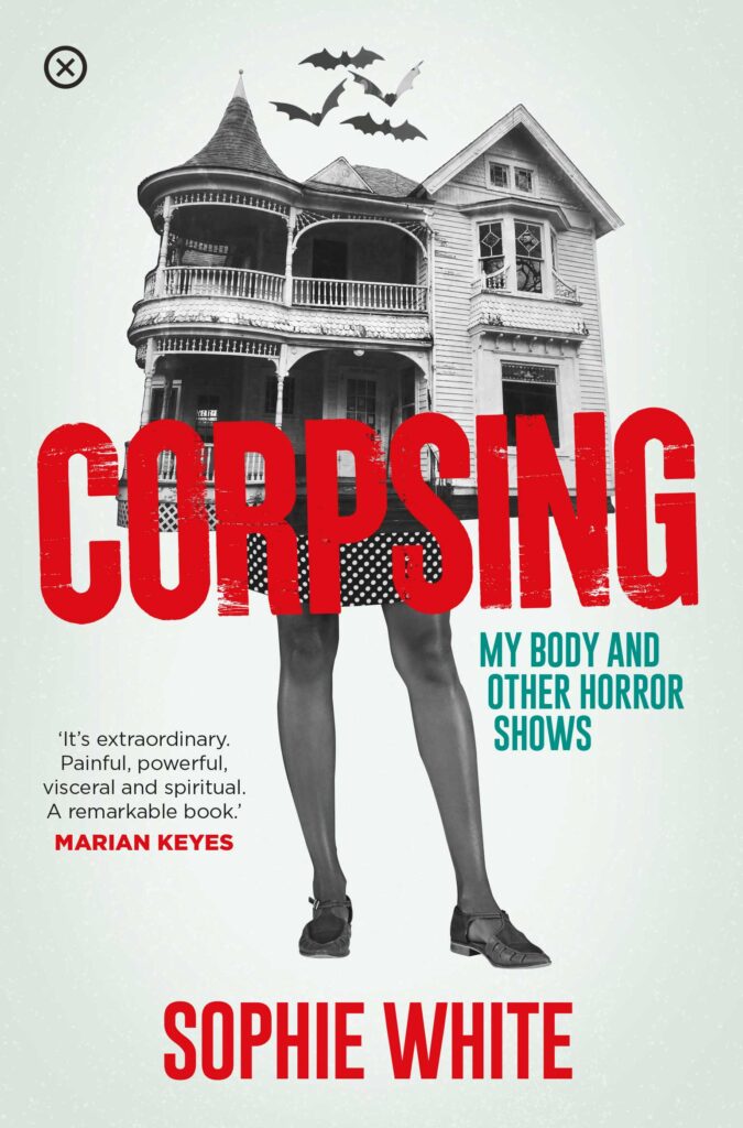
An interesting recent cover design was CORPSING for Tramp Press. Sophie White is a well established writer and early on I had a long phone call with her; it turns out she is very involved in visual arts and we had a great discussion about what we both like and dislike visually. The eureka moment came while having a coffee with Lisa Coen and Sarah Davis Goff of Tramp Press: Sarah described the book as a “haunted house story—but her body is the haunted house.” I instantly had the idea of the dilapidated haunted house on a set of very strong, modern, woman’s legs.
I wanted it to have a bold, unsophisticated, almost punk rock feel, so the collage style worked really well (I was very much channelling Northern Irish artist Seán Hillen, whose work I love. I mentioned this to Sophie after the fact and she sent me a photo of a Seán Hillen print in her kitchen!). The Ghost House Lady took on a life of her own and became the subject of a number of craft pieces Sophie created. Eventually Winnie The Wool Wagon launched an embroidery kit based on the cover design. Definitely a first for me!
This cover ticked all the boxes that make me love this job: an author onboard for some visual fun; a publisher who understands the importance of coffees and chats; an idea that sparked collectively and instantly felt like the right one—that has since gone on to have an independent life of its own.
What is the best aspect of being a cover designer?
I think most of all I love working for myself, I love that I can be working on a dystopian novel in the morning, correcting work on a book on Medieval Handbells after lunch and line up a meeting with a Theatre Company for the next day. I love that even if I have to work late or through weekends (which can happen!) it’s for my own benefit. I also love when there’s nothing to do on a random sunny Tuesday and I can give myself the day off!
Who is a designer that you greatly admire?
I think my overall design hero has to be Paul Sahre. I came across his lecture “Paul Sahre: A Designer And His Problems” online and it pulled me out of a professional rut and made me wonder could I become a self employed designer too. As well as being a skilled designer who constantly pushes the edges of editorial design, he is also very funny and self deprecating, which you don’t often get in the world of design.
There seems to be a great crop of book designers working at the moment who I really enjoy following, who make me try to push myself harder. These include Jonathan Pelham, Jack Smyth, Rafi Romaya, Sarah May Wilkinson, Alex Kirby and Lauren Wakefield. Here in Ireland I really enjoy Niall McCormack’s beautiful detailed work and Kate Gaughran and Cathal O’Gara’s covers too.
What do you look for in a good cover design? Do you think designers assess book covers differently to someone browsing in a book shop (and how do you negotiate these two things)?
If anything I think being a book designer makes me a total sucker for judging a book by its cover. I have shelves full of books I may never get around to reading, but that I just love owning because they’re so cool looking!
I only twigged recently that my parents house is full of book shelves and rows and rows of books about everything under the sun. So it’s obviously some sort of sense of “home” I’m trying recreate by being surrounded by books all the time!

You can find out more about Fiachra McCarthy and view his work here
Read Niall McCormack in Under the Covers
