Niall McCormack talks to Ruth McKee —for the first in our new series featuring Ireland’s finest cover designers
A good book cover won’t help the sales of a bad book—but a bad book cover will hinder the sales of a good book.
How much influence should/does the author have in the eventual cover design?
The input of the author varies quite a bit. For the most part they don’t have a direct input into the process but will be consulted once a number of cover options have been created. I have had situations where the author had a strong reaction to the proposed cover designs. In those cases it is best to change approach to accommodate their point of view. Compromise is central to the design process, every decision is a balance of competing requirements.
Do you have the freedom to design exactly how you want to, or are you constrained by other factors?
The process usually works best when it is collaborative in nature. There are a lot of factors that need to be kept in mind when designing a cover, including the title, mood and narrative of the book as well as the genre and intended audience. Is it for a general or specialist audience and what is the age group? Are there existing titles in the same area and recent cover trends to be aware of? Where will it be on sale? Does the author have an existing brand/style that they are recognised by? Are they new or established? Does the publisher have a house style or does the book fit into one of their series? Will the book be paperback or hardback? Is there scope for special finishes such as embossing, spot varnish French flaps, die cuts, cloth covering or quarter binding? Is the book primarily text or visual? Is it just the cover to be designed or the whole book? The answers to all of these will dictate the form that the book will take. It helps to have a good working relationship with the publisher and an understanding of their previous books and audience.
What are the most interesting books you have worked on recently?
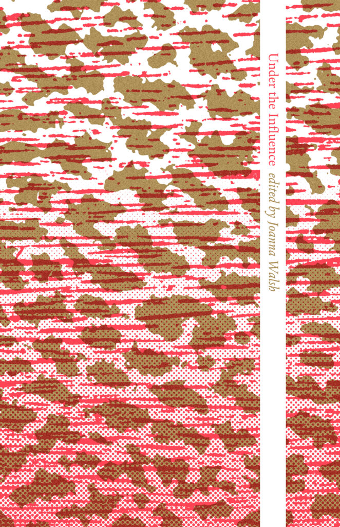
I was designing book covers for at least a decade before I started working on the covers of gorse journal. Susan Tomaselli’s openness and belief in my abilities helped me to make a significant step forward with my work. Having those cover designs recognised at the American Institute of Graphic Arts’ 50 Books 50 Covers awards was a great boost to my confidence. I have just completed the design of Under the Influence, a new book in their Gorse Editions series. As gorse is experimental in nature, I have been able to break with existing cover conventions while also referencing the rich heritage of Little Magazine design both from Ireland and internationally.
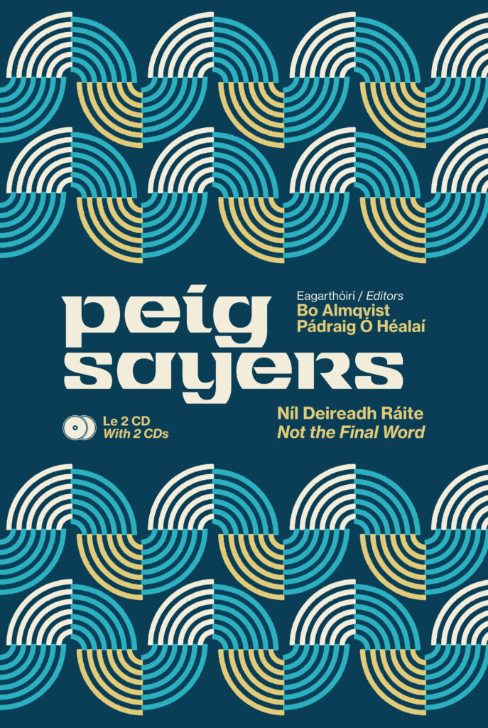
I recently designed the cover of Peig Sayers’ Níl Deireadh Ráite | Not the Final Word for New Island. The cover features the modernist gaelic typeface Tuam Uncial, designed by Jarlath Hayes. It is best known from its use on the titles of the TV series Glenroe.
The tension between modernity and tradition are inherent in the typeface and despite its kitsch associations it is considered to be a classic example of Irish modernism.
The typeface has been carefully restored by Max Phillips of Signal Type Foundry. The abstract geometric image of waves in the sea is reminiscent of 1950s modernist textile designs. It is a nod to the period in which the recordings that make up the book were made but it also has a contemporary feel. The design places Sayers’ work in a modernist setting, countering the unfair, but pervasive, negative perceptions of her place in Irish culture.
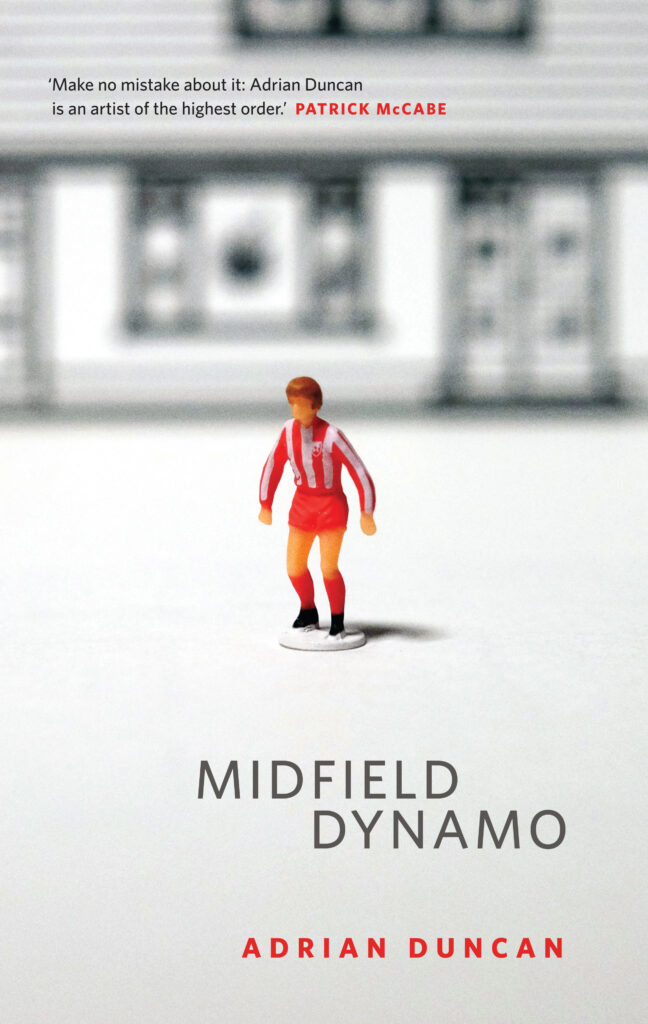
Adrian Duncan’s third book is a collection of short stories titled Midfield Dynamo (Lilliput Press). The stories cover a wide range of situations and characters but they all share a wonderful oddness that brings the collection together. Duncan’s experience as a structural engineer suffuses his work with references to construction and design. One story features a house built from plans featured in Bungalow Bliss. Another is titled after the Red Star Belgrade midfielder Robert Prosinečki.
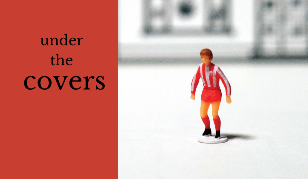
For the cover I placed a Prosinečki Subbuteo figure in the garden of a Bungalow Bliss house, the juxtaposition of elements fits with the surreal mood of the stories.
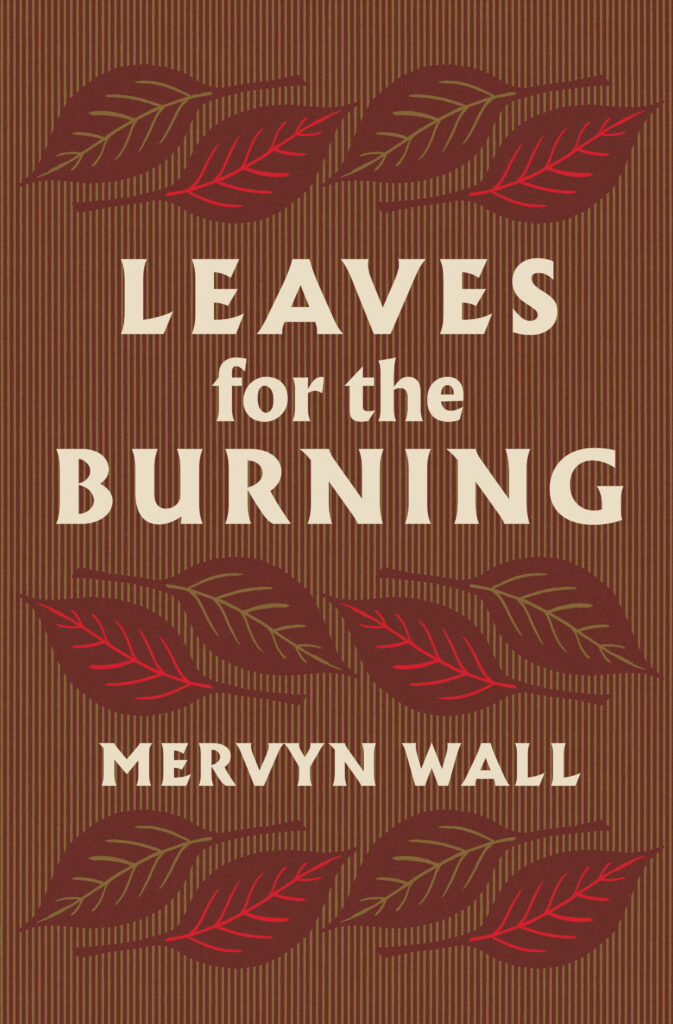
Leaves for the Burning is a moody mid-century novel by Mervyn Wall. Swan River Press have been bringing Wall’s work back into print in recent years with reissues of the classic Fursey novels and a strong collection of short stories, A Flutter of Wings. I was delighted to be given the opportunity to create a new cover for their reissue of Leaves for the Burning. It is a book that I read a few years ago and it has remained with me since.
Who is a designer that you greatly admire?
Book design in Ireland has gone through a very strong patch over that last decade or so. I always enjoy seeing Fidelma Slattery’s work, she has designed some beautiful books for the Royal Irish Academy in recent years. Her work has a warmth that makes the books inviting and accessible. Graham Thew is another designer whose work I admire, he has a great range but I particularly like his use of illustration and expressive lettering. Anna Morrison and Jack Smyth are two Irish designers doing great work in the UK at the moment. They both produce bright, intelligent designs that jump off the shelves in shops. It is great to see Irish designers working at the top level internationally.
I have a strong interest in the history of Irish book cover design with a particular focus on the first fifty years after independence. There is an abundance of talented artists and designers whose work has all but been forgotten. These include Victor Penney, Cor Klaasen, Olive Cunningham, Austin Molloy, Ruth Brandt, Anne Yeats, Karl Uhlemann and Bill Bolger among many others. I hope to bring my research together in book form in the next couple of years.
What is the best aspect of being a cover designer?
Being involved with the creative process as it is ongoing is the most satisfying aspect of book cover design. I get to read books months, and in some cases years, ahead of their release to the public. Having a hand in how the text will take a physical form is a great honour.
Knowing that the design will become intertwined with the text in the mind of reader is not something that I take lightly.
Niall McCormack is an artist based in Dublin, Ireland. He specialises in music packaging and book design. A graduate of the National College of Art and Design, Dublin, Niall has created numerous LP and CD covers for Ace Records as well as sleeves for Vampisoul, Tru Thoughts, Domino, WFMU, Demon Music Group, Planet Mu and Fire Records. His artwork graces book covers published by Vintage, Faber & Faber, Profile, The Lilliput Press, Gorse and Poetry Ireland. You can contact Niall, and find out more about his work on his website and read about Irish book cover design on his blog: Vintage Irish Book Covers


