Not just a pretty picture—Sarah O’Flaherty talks about the collaborative process of good cover design, and the joy of a blank slate for the next Under the Covers
How do you start?
First, the editor gives me an overview or synopsis of each title. Sometimes if I feel it’s needed I will read some of the manuscript because even the smallest detail can spark a concept for the cover.
I make notes as I go along of any scene, descriptions of characters or key elements that might form the basis of a cover.
You also have to keep audience at the forefront of your mind throughout your creative process. You have to ask yourself ‘Who is this for? Who’s our target audience? Who are the target retailers? What’s the competition?”
I will then present three or four different cover concepts to the publishing team and which direction a concept should move in is discussed. Sometimes you can come up with a brilliant concept, but actually, that concept doesn’t translate into a decent book cover. So however good the idea, you have to let it go and try something else.
What is the most misunderstood aspect of cover design?
I think people can view a cover design’s only purpose as simply to create a pretty picture.
The cover design is so much more than that: it’s visual communication. It is a language, a way to communicate through whatever it is presenting. Covers can be a swift way to signal genre, but great covers do more than this—they give a face to a book’s personality. They’re what will make you pick it up in the first place.
How much influence should/does the author have in the eventual design?
Sometimes I’ve worked with authors at the start of a project, if they have ideas they have shared. Usually though it’s only if the author has feedback on an idea myself or the publisher has shown them, so we can develop the design to a point where they feel we’ve really captured the spirit of the book.
Do you have the freedom to design exactly how you want to, or are you constrained by other factors?
Collaboration is part of the whole design process.

When designing a book cover there is a surprising number of people involved in the approval process: publishers, marketing team, editors, authors and booksellers. The art of conveying an entire manuscript into a single image, and making sure it’s targeting the right audience, is a task taken on not just by designers, but by editors and the marketing, sales and production teams.
What’s one of your favourite covers you have worked on?
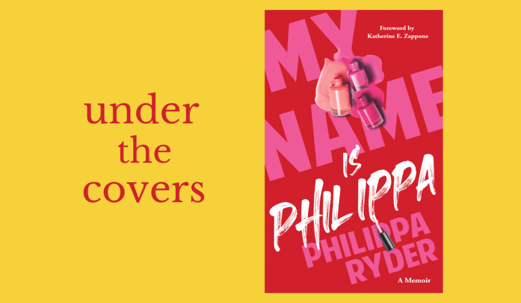
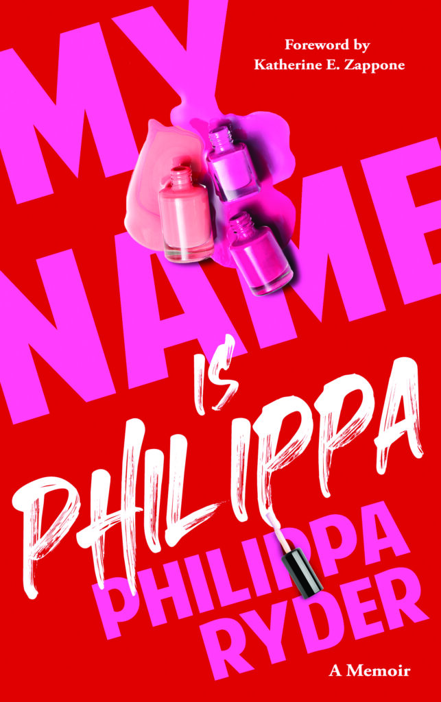
There have been so many covers I just loved working on and picking a single one is such a struggle. More recently the one cover that comes to mind is My Name is Philippa by Philippa Ryder and published by Mercier Press.
The publisher and author wanted to stay away from the common trend of a lot of memoirs where you would have a photograph of the person on the cover with the title of the book.
For a designer it’s always exciting when you have creative freedom because the author and publisher are being braver in their choices of designs and really want their book to stand out on the busy shelves.
I used bright colours so the book would project an upbeat, enthusisatic feel to get across the type of story within: it’s a story about love, understanding and a family who stuck together as Philippa moved from husband and father to wife and mother.
I also pulled the little detail of Philippa’s love for nail varnish and used that to create an interesting visual.
A book cover should make you think, should make you puzzle a little, wondering, “Now what’s that about?” and hopefully it makes enough of an impact to get someone to pick it up and turn it over.
What is the best aspect of being a cover designer, and what is the worst?
The best aspect of being a cover designer is that you can create any kind of artwork. The vast number of genres and styles that apply to designing covers leaves room for so much creativity and imagination!
To me book covers are the perfect blank slate for design work, I can create anything from non-fiction minimalism to colourful and detailed fantasy.
Because you are designing for someone else the worst part can be having to let go of a design you really love because the publisher or author want to go in a different direction. But ultimately if this happens you realise that however much you liked the design it wasn’t the right cover to capture the book.
You can find more of Sarah O’Flaherty’s work @sarahofdesign


